
DataMeetsArt in Luxembourg 2024 - Winners
The Grand Finale of the DataMeetsArt in Luxembourg 2024 was held on June 13th at the Casino Luxembourg - Forum d'art contemporain. This was a first edition launched by Data Studio Luxembourg - and hopefully more to follow ;)
The purpose of this competition is to provide a platform and showcase the incredible creativity and talent of data analysts who strike a rich balance between Data Analysis, Design, and Storytelling. It also aims to raise awareness that data analytics is not only for experts, and dashboards don’t need to be boring and full of numbers!! 📊😊
During the event we presented each project on a large printed canvas, along with a (super cool!!) large interactive touchscreen - all methods to make the dashboards (and data) immersive and enable the users build a closer relationship with the data.
The rating was done by combining online voting over 5 days (282 votes in total) with feedback from a panel of industry experts. At this point I would like to thank Martina Zunica, Aida Horaniet Ibañez and Lorna Brown for joining in, dedicating their time to analyze each project, and providing valuable and constructive feedback! Much appreciated!!
And now.. the winners are:
📊 🎉👍
Infographics 🎨
Winner - Facts about Luxembourg by Ricardo Tranquilli Navarro
Silver - Roads of Luxembourg by Sitraka Forler + Elections by Alain Bertrand
Bronze Spotlight - Tourists' Numbers in Luxembourg by The Loupe
Dashboards 📊
Winner- Blue Zone by Eva Omedes Domene
Silver - Mortality rates in Luxembourg by Luxembourg Health Directorate - Direction de la santé and CTIE
Bronze Spotlight - vel'OH! by Niels Reimink
Video / Experimental 🔮
Winner- Getting out of the bubble with data and statistics (Video and AR) Superdot Studio
Coup de coeur
Tech Startups in Luxembourg by Yuting Xu
Taylor Swift by Rebecca Fritsche
Congratulations to everyone!! Checkout the individual posts on each project on LinkedIn and give each kudos 😎👌🔥
Thanks to everyone for joining the event and to all the data artists for participating!!
With the support of Ministry for Digitalisation - Luxembourg

Category: Infographics Winner: Facts about Luxembourg by Ricardo Tranquilli Navarro 📊 🎉👍 Author: Good morning! I have made this infographic making a general overview of your wonderful country. I hope you like it :) By Ricardo Tranquilli Navarro 🏅Jury: “I appreciated Ricardoʼs way to organise information, guiding the user from the generic and historical data to the most specifics. “ "Infographic is good balance between text, images and data visualisation" "The use of icons and illustrations support the information and help the user through the story." Overall majority in online voting
![Category: Infographics
Silver (shared): Luxembourg Legislative Elections by Alain Bertrand 📊 🎉👍
Author: Municipalities coloured by party results. "I can now easily generate a [higher resolution] now that I have improved the original super-ineffic](https://images.squarespace-cdn.com/content/v1/647b27752e647a77f710e1d7/3572f45e-bdf9-432f-b304-78a17c558475/LuxElections.jpg)
Category: Infographics Silver (shared): Luxembourg Legislative Elections by Alain Bertrand 📊 🎉👍 Author: Municipalities coloured by party results. "I can now easily generate a [higher resolution] now that I have improved the original super-inefficient python code. 😁 I intend to create a version with the EU election results from Luxembourg when the result data is available. 🏅Jury: It is a very creative way of expressing the votes for each party in the different municipalities, without the objective of communicating precise percentages, but rather the predominant colours in the country. The infographic is eye catching and done with passion using Python! Great design with potential by further adding context and storytelling.

Category: Infographics Silver: Roads of Luxembourg by Sitraka Forler 📊 🎉👍 Author: Roads of Luxembourg. Easily Create Your Own City Street Map in python ! Now you will just have to take the code, copy paste it in your favorite Python IDE (Jupyter, VSCode, Google Colab etc.) and to press the run button. ;)) 🏅Jury: The infographic is eye catching and done with passion using Python! Great design with potential by further adding context and storytelling.

Category: Infographics Bronze Spotlight: Tourists' Numbers by The Loupe 📊 🎉👍 Author: Tourists' Numbers. "The live installation "Tourists' Numbers in Luxembourg '' (on June 13 at the Casino) provides a way for people to interact physically with data. Visitors are encouraged to write cards to their relatives or friends, who visited them in Luxembourg and pin the cards to the infographics". 🏅Jury: The idea of displaying the years in a radial form works well visually and still allows us to get a feeling of the trends. A very innovative approach that enables the audience to engage with the data by writing physical cards.

Category: Dashboards Winner: Blue Zones by Eva Omedes Domene 📊 🎉👍 Author: I talk about healthy lifestyle habits such as a good diet and practicing sports, to live a longer and healthier life. 🏅Jury: "The dashboard is well-designed, it contains plenty of information and it is easy to navigate. The definitions, annotations and key indicators engage the reader to explore the dashboard.". "I really love the design and layout of this dashboard. It looks and feels like it belongs in a gallery. I love the information and the way it is presented in a simplistic way" "The design is neat and clear, the dataviz makes it easy to process lots of information and compare categories, but what I liked the most is the storytelling." "Good use of the colors.." Well done!

Category: Dashboards Silver: Mortality rates in Luxembourg by Luxembourg Health Directorate - Direction de la santé and CTIE 📊 🎉👍 Author: Causes of death statistics and mortality rates in Luxembourg. 🏅Jury: "Given the complexity and the amount of data visualized in the dashboard, I appreciated the clarity they visualized in the storytelling" The charts are correct; the labels complement the viz when it’s not easy to get the number from the viz itself, and it’s nice to have a visual rhythm by using different kind of charts or combining them. Good use of the cards at the hover of the mouse. They’re insightful!" Well done! Overall majority of online voting.

Category: Dashboards Bronze Spotlight: Vel’OH by Niels Reimink 📊 🎉👍 Author: "Based on live data and updated every few hours, the Vel’OH dashboard provides insights into the usage of Luxembourg’s most popular green transport option: the Vel’OH bike! Easily find your favourite stations using the area filter and check bike availability on an hourly basis." 🏅Jury: "This is a simple dashboard straight to the point, that conveys all the key metrics about the use of the Vel’OH. An alternative could be to split the views and add some navigation, but it also works well as an all-in-one view summary." "The dashboard is really nice, simple, but effective. The text supports the charts and the information is clear. I appreciated the zeros in red." Nice!

Category: Dashboards Coup de Coeur: A Glance at Tech Startups in Luxembourg by Yuting Xu 📊 🎉👍 Author: A Glance at Tech Startups in Luxembourg. Visualization project for participating in Data Meets Art competition. This visualization project offers a detailed overview of the tech startup landscape in Luxembourg. (Using data from STATEC and Eurostat) 🏅Jury: "Follows a good logical story as it goes through the timeline. Very nicely presented.” “Absolutely beautiful design” “The lines are for visual purposes, and then there are the regular bars to compare values. Well done!” Coup de coeur majority in online voting.

Category: Dashboards Coup de Coeur: Taylor Swift by Rebecca Fritsche 📊 🎉👍 Author: Taylor Swift's Biggest Moments of 2023. While Taylor Swift's popularity has grown across the decades, her place in popular music last year was an all-consuming force. By clicking on the icons, you can revisit the major moments as well as ups and downs that Taylor Swift had in 2023 and learn why the last year was the biggest of her career (yet). 🏅Jury: “The project is fun and rich in information.” “Rebecca has put so much thought and effort into creating this project. It's a good mix of exploratory and explanatory dashboards. Really clean design and lots of information. I'm going to nominate this dashboard for Viz of The Day with Tableau!”. “I especially love the album portraits, the design of the multivariate data glyphs to convey how she has reinvented herself multiple times according to different aspects is a great idea!”
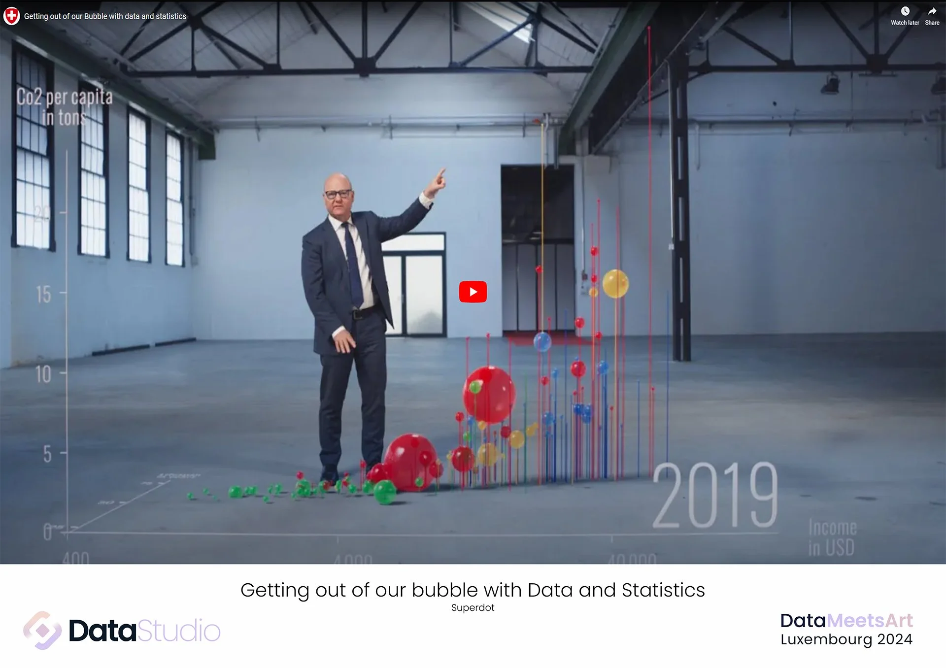
Category: Videos / Experimental AR Winner: Getting out of the bubble with Data and Statistics by Superdot Studio 📊 🎉👍 Author: For the visualization from Hans Rosling, which combines 150 years of data on income and life expectancy across more than 150 countries by continent, we added a CO2 per capita data dimension. We addressed the task of managing numerous data points, each moving along a vector path in 3D space, by developing custom Python code and integrating it into Blender. The result is an animated 3D video layer. 🏅Jury: In this specific scenario, using 3D visualization allows users to explore data in greater depth. Additionally, Augmented Reality (AR) is an intriguing tool for experimenting with data visualization, creating immersive experiences that bring users closer to the information and deep dive into the data. Fascinating! (Overall majority in online votes)


Get in touch with the participants
Elections 2023 by Alain Bertrand
Facts about Luxembourg by Ricardo Tranquilli Navarro
Roads of Luxembourg by Sitraka Forler
Tourism in Luxembourg by The Loupe
Blue Zones by Eva Omedes Domene
European energy directives by Lytix
Mortality rates in Luxembourg by Luxembourg Health Directorate - Direction de la santé and CTIE
Open data at Swiss National Science Foundation (SNSF) by Superdot Studio
Startups in Luxembourg by Yuting Xu
Taylor Swift's Biggest Moments of 2023 by Rebecca Fritsche
vel'OH! by Niels Reimink
Getting out of our bubble with Data and Statistics by Superdot Studio
Rejustify by Vojtech Seman
Organized by the Data Studio Luxembourg Supported by the Ministry for Digitalisation - Luxembourg